
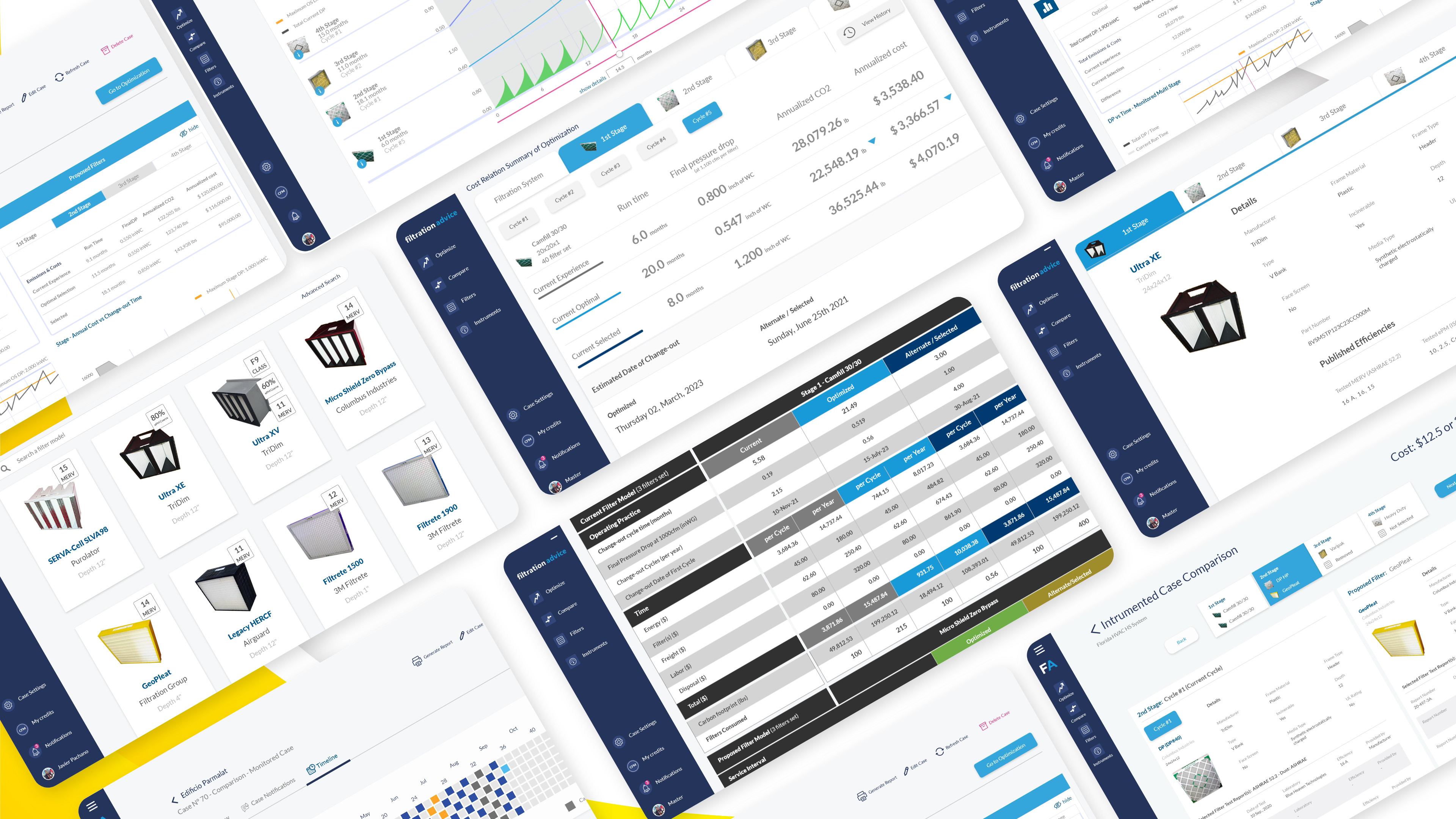

B2B AIR-FILTRATION MANAGEMENT PLATFORM
Helping organizations evaluate filter performance, Total Cost of Ownership, Carbon Footprint, and operational change-out strategies.
ROLE:
Product Designer
Product Designer
TIMELINE:
2020–2024
RESPONSIBILITIES:
User Flows · Interface Design · Data Visualization · Brand Identity · Training Documentation
User Flows · Interface Design · Data Visualization · Brand Identity · Training Documentation
TOOLS:
Adobe XD · Illustrator · Photoshop · InDesign · Figma
COLLABORATION:
Clients and HVAC specialists · Front-end development · Content specialist
The Challenge
Filtration Advice began with technical requirements and an earlier interface that was difficult to use. The platform needed clearer information architecture, guided data-entry workflows, and results that could transform complex HVAC calculations into practical decisions.
My Contribution
As Product Designer, I translated stakeholder goals and required system inputs into the complete product experience. I defined the information architecture, user flows, prototypes, interfaces, dashboards, brand system, and training documentation while collaborating with clients, HVAC specialists, front-end development, and content.
Structuring the Product
I organized Filtration Advice as a connected platform rather than a standalone calculator. Role-based access connects users with optimization, comparison, filter data, reporting, notifications, and organizational management tools.
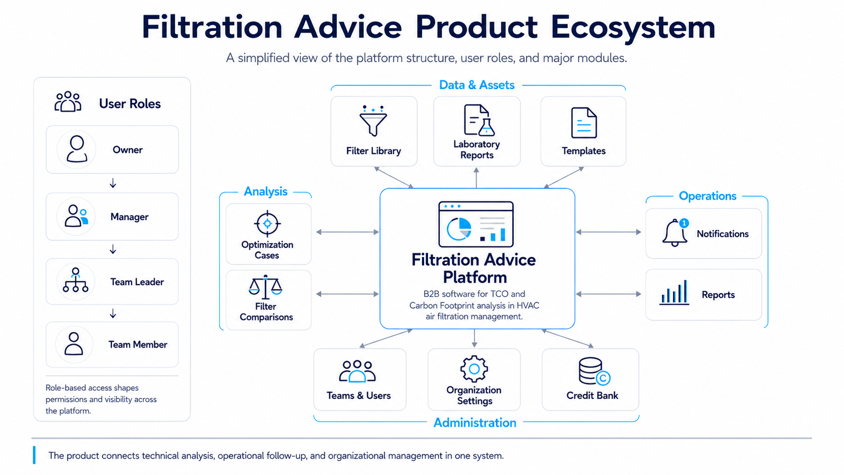
A high-level view of the platform’s roles, modules, and supporting services.
Core Product Flows
I structured the experience around four connected journeys: entering the correct workspace, creating an optimization, comparing filters, and turning the analysis into an operational decision.
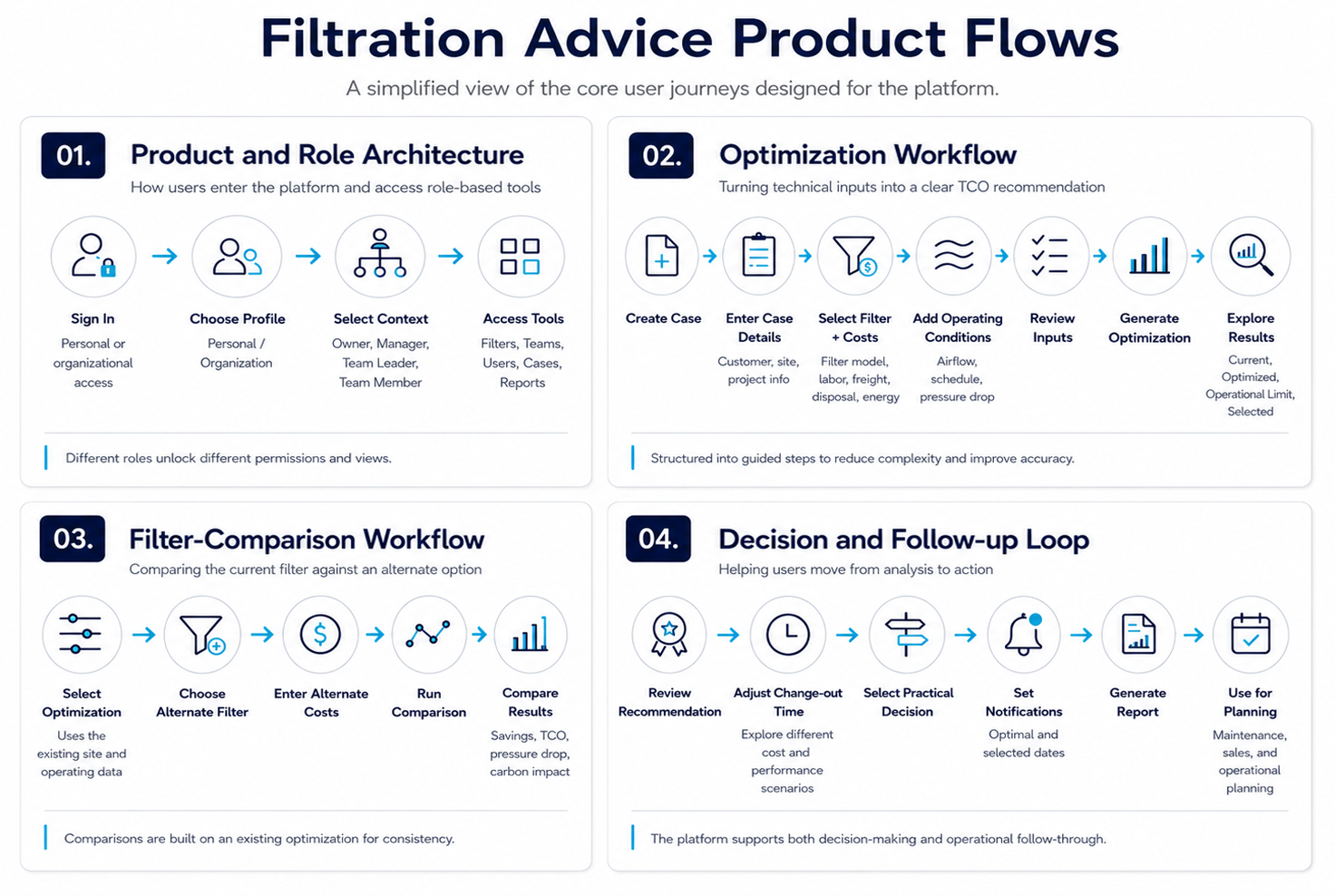
The primary journeys connecting platform access, technical analysis, comparison, and follow-up.
With the core journeys established, the next challenge was making a technically demanding optimization process easier to complete.
Simplifying Technical Data Entry
Each optimization required users to provide detailed technical, operational, financial, and environmental information. Presenting every field at once would have increased cognitive load and the risk of incomplete or inaccurate inputs.
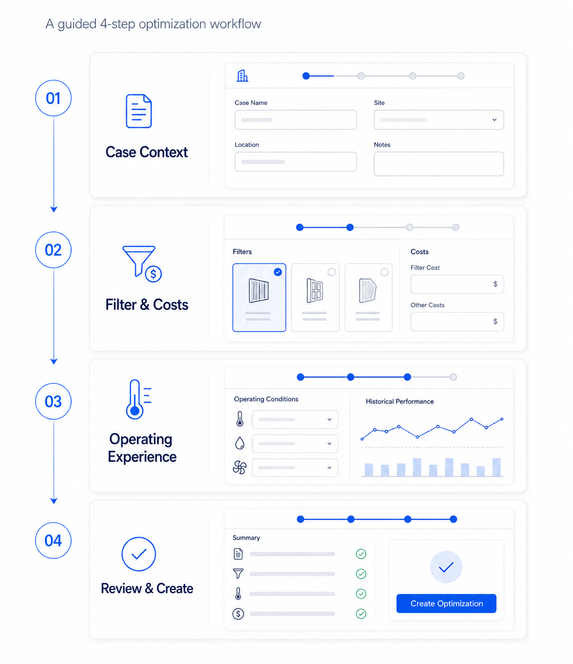
I divided the process into four guided stages: case context, filter and costs, operating experience, and final review. Related fields, units, instructions, and calculated values were grouped together so users could focus on one part of the process at a time.
Four design goals guided how the optimization workflow was structured:
● Reduce Cognitive Load
Divide complex information into clear, manageable stages.
Divide complex information into clear, manageable stages.
● Create a Predictable Flow
Show progress, required information, and the next action clearly.
Show progress, required information, and the next action clearly.
● Improve Input Accuracy
Pair fields with labels, units, guidance, and calculated values.
Pair fields with labels, units, guidance, and calculated values.
● Build User Confidence
Let users verify their information before generating results.
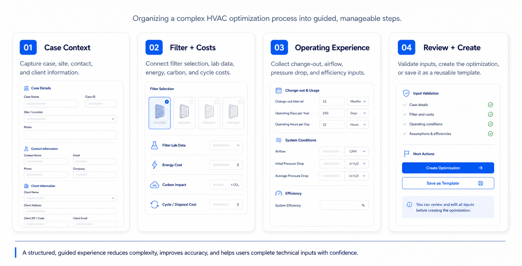
The optimization form progressively reveals case details, filter costs, operating conditions, and final review.
Entering the data was only the first half of the experience. Users also needed to understand what the calculations meant and how different filter change-out strategies would affect cost, pressure drop, and Carbon Footprint.
I organized the results around four comparable scenarios: current experience, optimized performance, operational limit, and a user-selected option.
Interactive charts and TCO summaries allowed users to explore trade-offs, adjust the change-out time, and choose an approach that reflected real operating constraints.
The interface combined recommendations with exploration, giving users a calculated optimum without removing their control over the final decision.
The interface combined recommendations with exploration, giving users a calculated optimum without removing their control over the final decision.
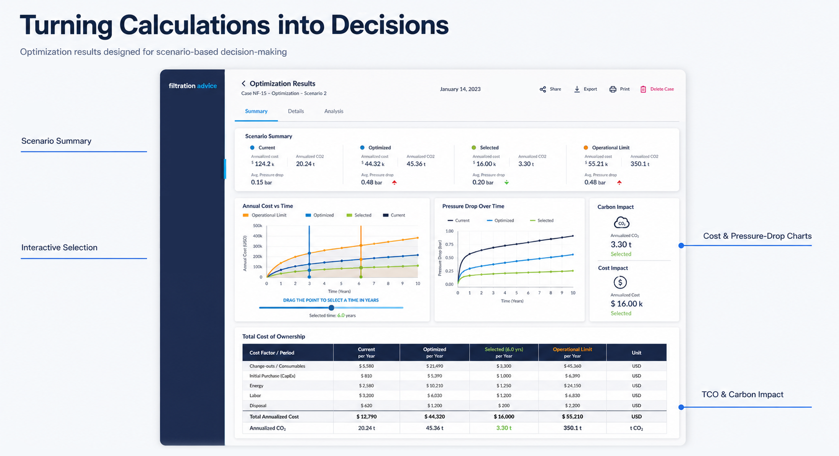
The results dashboard connects scenario summaries, interactive charts, and detailed cost data within one decision-making experience.
Comparing Operational Trade-offs
Each scenario was evaluated through the same four factors: change-out time, pressure drop, annualized cost, and Carbon Footprint. Presenting these outcomes consistently helped users compare options without switching between separate reports or screens.
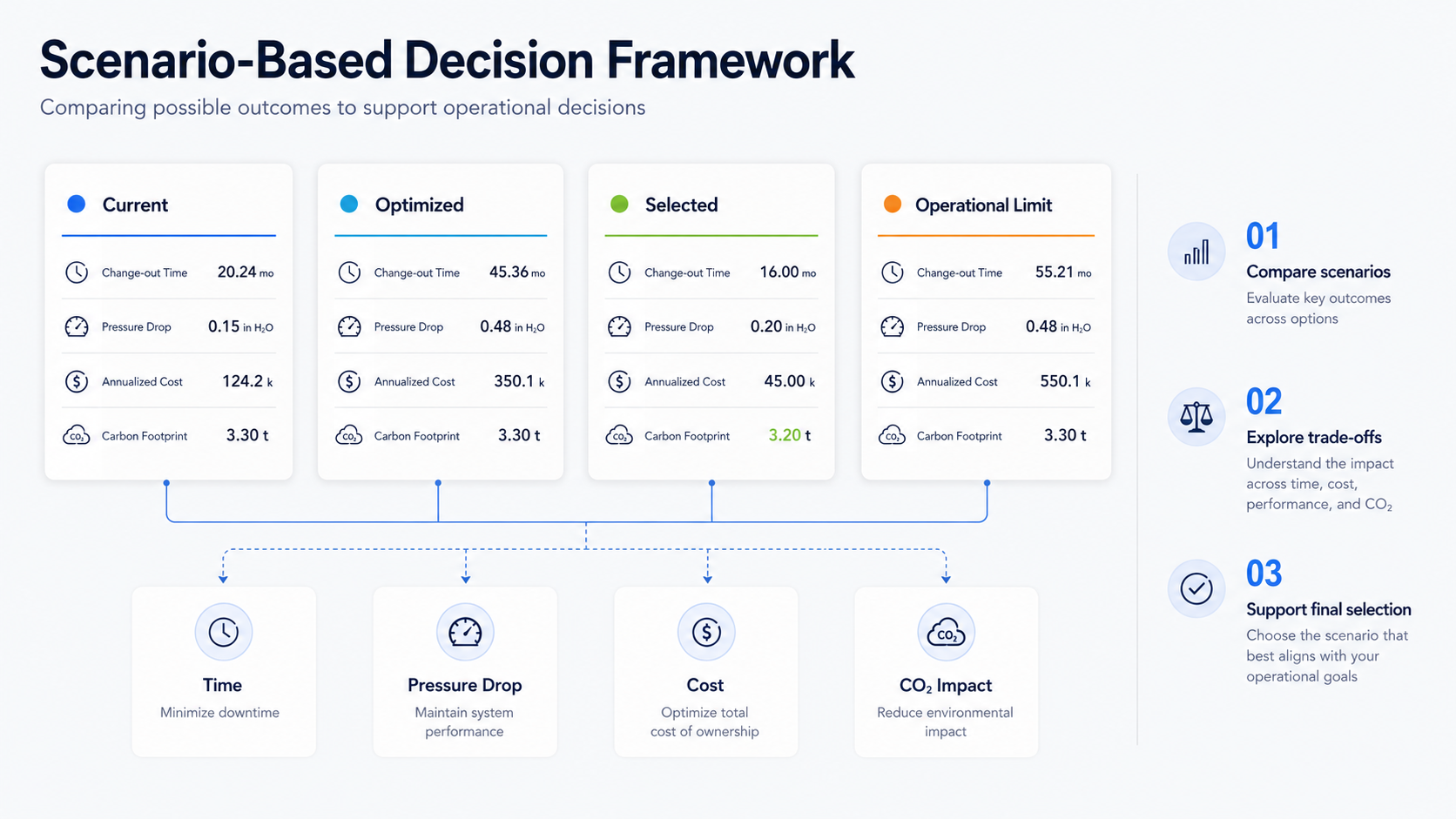
A consistent comparison model helps users evaluate trade-offs and select the scenario that best fits their priorities.
Building a Scalable Product System
As Filtration Advice expanded, it needed to support personal and organizational workspaces, different user roles, case management, filter resources, comparisons, reports, templates, notifications, and administrative tools.
I created a structured information architecture and reusable interface patterns so these features could grow as part of one connected product rather than a collection of separate tools.
The architecture separates personal and organizational workspaces while connecting shared analysis, management, and reporting workflows.
The architecture separates personal and organizational workspaces while connecting shared analysis, management, and reporting workflows.
So we moved forward with 4 goals in mind:
● Create predictable patterns
Reuse navigation, layouts, actions, and components across modules.
● Support role-based access
Organize visibility and permissions for Owners, Managers, Team Leaders, and Team Members.
● Connect product capabilities
Link cases, comparisons, filters, reports, teams, templates, and notifications.
● Prepare for growth
Create structures that could accommodate new roles, modules, and workflows.
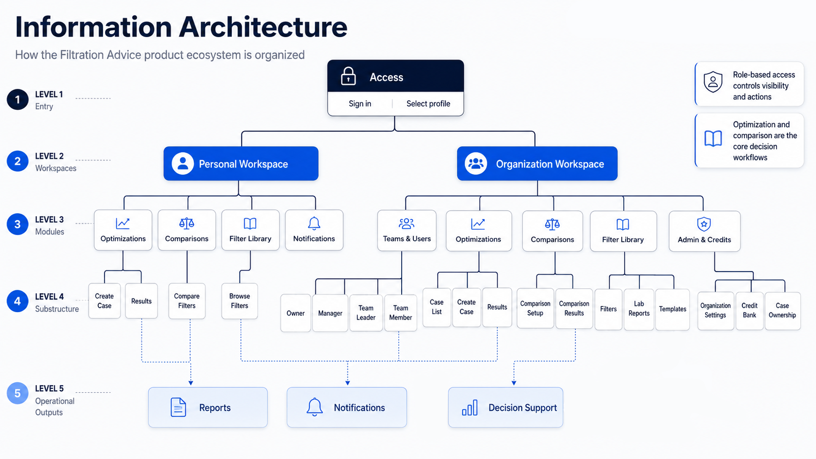
Role-based access connects workspaces, modules, permissions, and operational outputs across the platform.
Creating a Unified Brand and UI Language
As Filtration Advice expanded, the product needed a visual language that could remain consistent across interfaces, reports, presentations, web materials, and training documentation.
I developed the brand identity and translated it into reusable interface patterns, including typography, colour, navigation, form elements, cards, buttons, progress indicators, tables, and system states. This helped separate features feel like parts of one connected product.
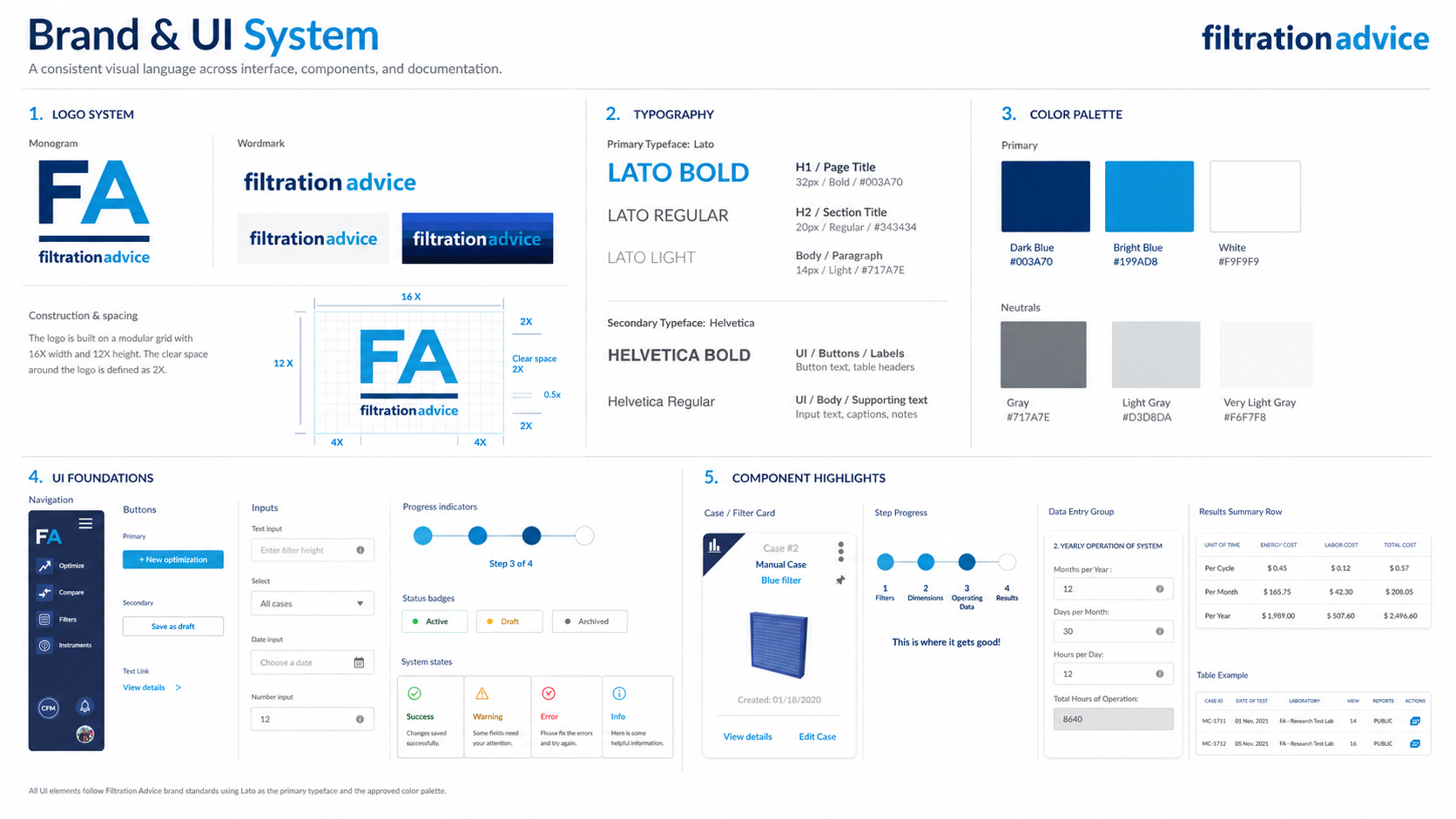
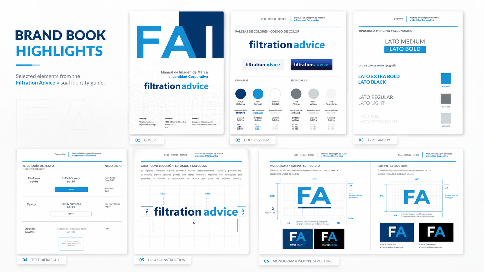
A unified visual and instructional system designed to make the platform consistent, recognizable, and easier to learn.
Cross-Functional Collaboration
I worked directly with the clients through continuous review sessions to understand what the product needed to accomplish. Because the calculation engine remained outside my scope, I focused on the layer users interacted with: organizing required inputs, structuring workflows, presenting technical results, and ensuring that every feature remained understandable and visually consistent.
I also collaborated closely with the front-end developer throughout implementation, reviewing how designs translated into the working product and adapting solutions when technical requirements changed. A content specialist supported the product messaging, written materials, and presentations.
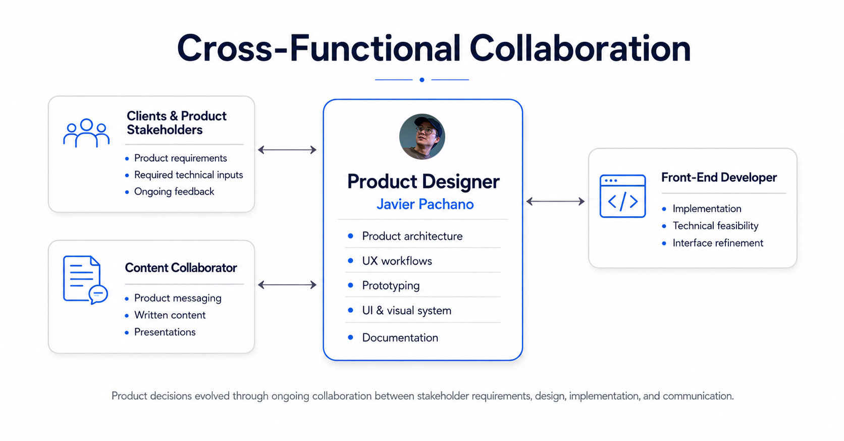
Stakeholders defined the product requirements and technical inputs; I translated them into the structure, interactions, and visual experience users interacted with.
Outcome & Reflection
Filtration Advice taught me that designing a complex product is not about removing technical depth. It is about organizing that complexity so users can understand what is required, interpret the results, and act with confidence.
My work connected the technical calculations to the user experience through guided data entry, scenario comparison, decision dashboards, product architecture, a consistent visual system, and supporting documentation.
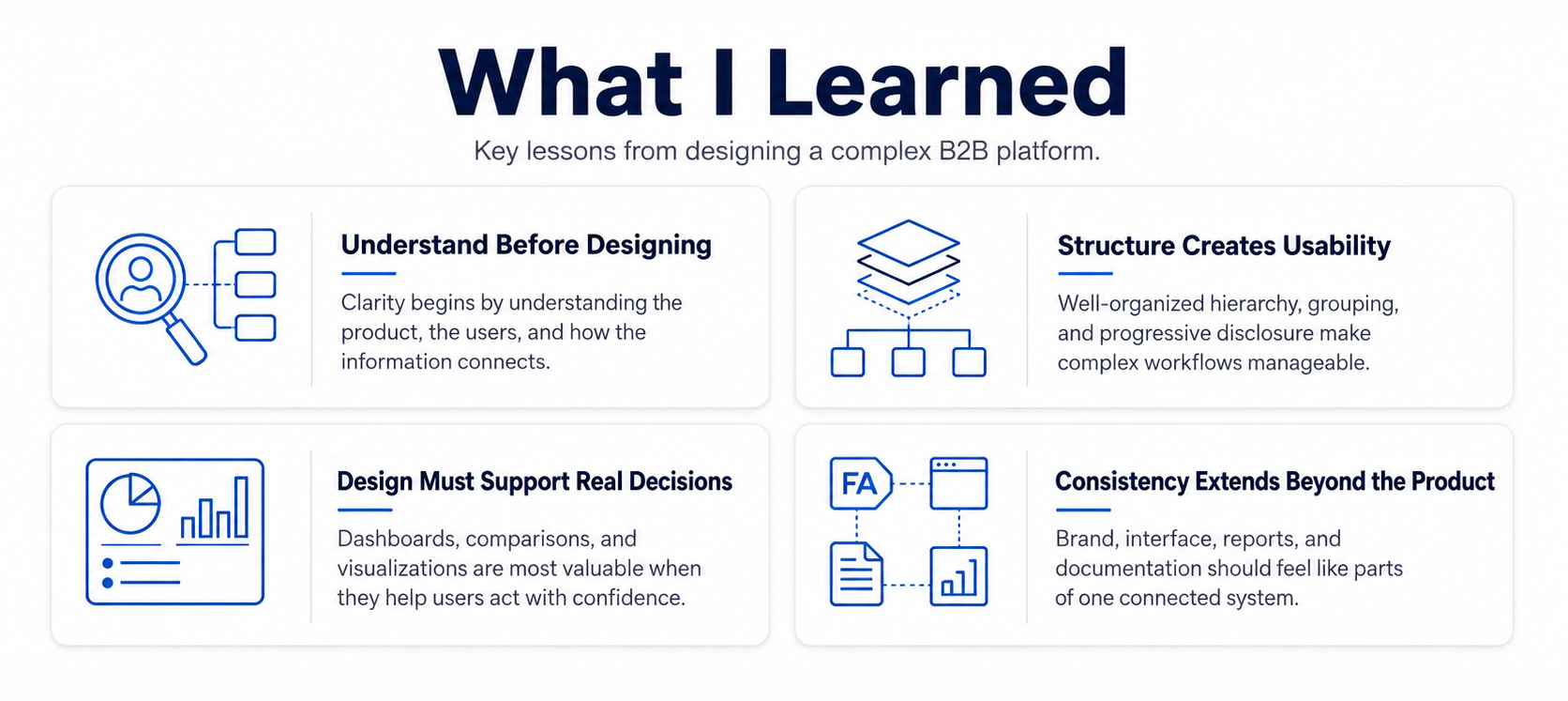
Good product design does not hide complexity, it gives complexity a structure people can understand.
Interested in how I approach complex products?
View my next case study or get in touch about a product design opportunity.