
A.G.A
ALL GOOD AUTOBID
A safer, Ottawa-focused car buying experience designed to reduce risk and uncertainty through verification, clear information architecture, and usability validation.
UX/UI Design · Research · Information Architecture · Prototyping
ROLE:
UX/UI Designer - Lead
TIMELINE:
UX/UI Designer - Lead
TIMELINE:
5 Weeks - 60+ hours
METHODS:
Research framing · Personas & journeys · IA & flows · Wireframes · Prototyping · Usability testing · Accessibility thinking
TOOLS:
Figma · FigJam · Maze (testing)
This project is a fictitious scenario, completed as a part of Algonquin College Interactive Media Design program.
Context
Buying a used car is already stressful, and it gets harder when you’re new to Canada, don’t have local networking, and you’re not sure which platforms are safe to trust. AGA was shaped around that reality: reducing uncertainty through clearer standards, verification, and guided decision-making.
Problem Statement
Existing marketplaces can feel overwhelming, inconsistent in trust signals, and place the burden of verification on the user, especially for newcomers who don’t know where to start.
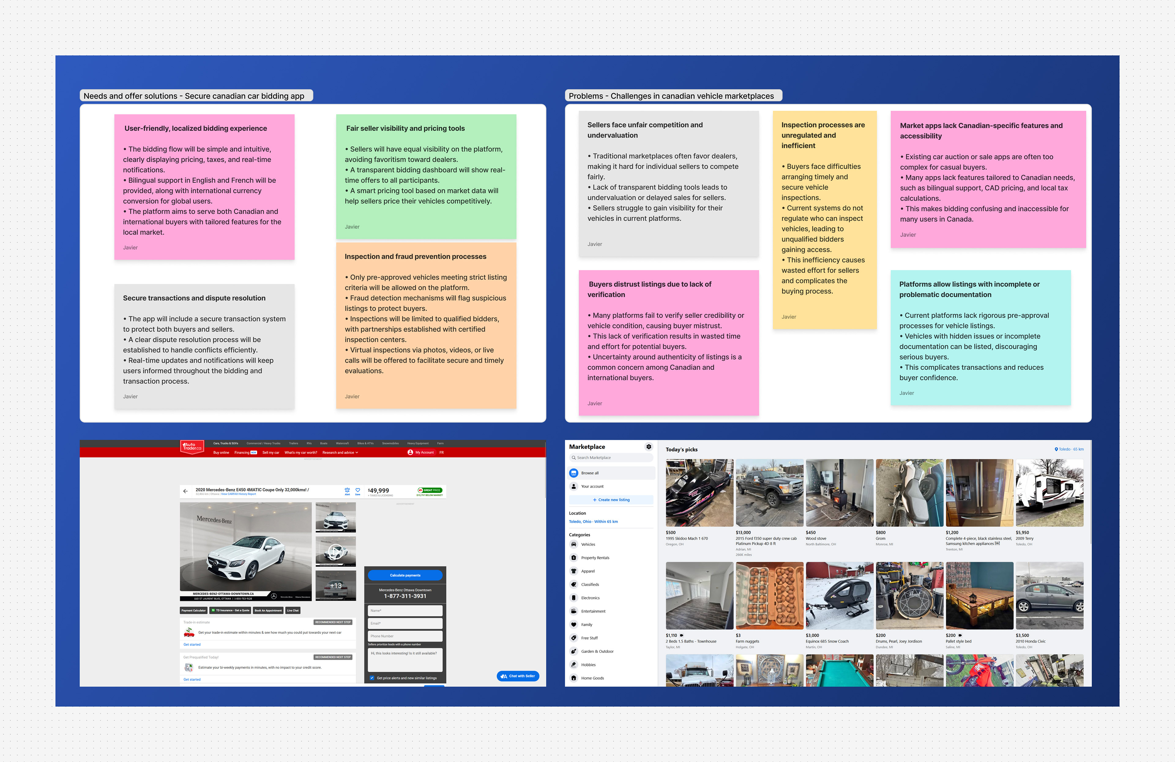
How we framed the problem space
To understand risk points and user anxiety, we started with:
● Competitive scan (AutoTrader, Facebook Marketplace) to identify gaps in verification, transparency, and user burden
● Stakeholder / peer consultation via focus-group style feedback to refine assumptions and feature priorities
● A clear definition of who is most impacted (newcomers, local residents, busy professionals)
Output: A clear set of risks to focus on, build trust from the very beginning and moments where the UI must provide stronger guidance.
Output: A clear set of risks to focus on, build trust from the very beginning and moments where the UI must provide stronger guidance.
Strategic goals
● Reduce cognitive load
Keep the experience simple, mobile-first, and predictable
Keep the experience simple, mobile-first, and predictable
● Support informed decisions
Make it easier to browse, compare, and bid with confidence
Make it easier to browse, compare, and bid with confidence
● Reduce risk
Make verification and transparency visible early
Make verification and transparency visible early
● Design for inclusion
Consider users who lack local networks and familiarity
Consider users who lack local networks and familiarity
with Canadian marketplaces
These decisions focus on reducing friction while reinforcing user confidence at every step.
Who we designed for
● Newcomers to Canada:
Need: a safer, more guided process with clear standards
Scenario: browsing without local networks or trusted referral
Scenario: browsing without local networks or trusted referral
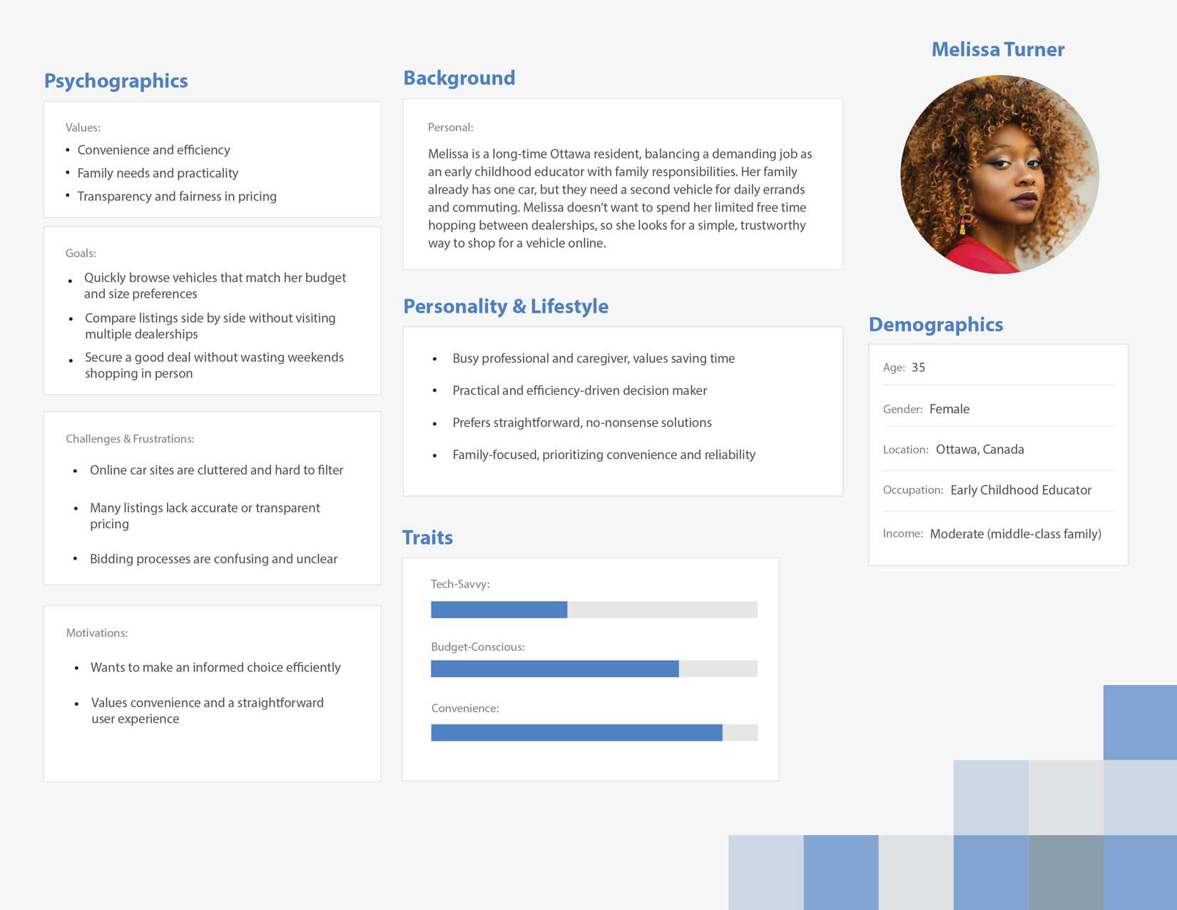
● Local residents :
Need: a transparent marketplace that saves time and reduces risk
Scenario: comparing options quickly and avoiding sketchy listings
Scenario: comparing options quickly and avoiding sketchy listings
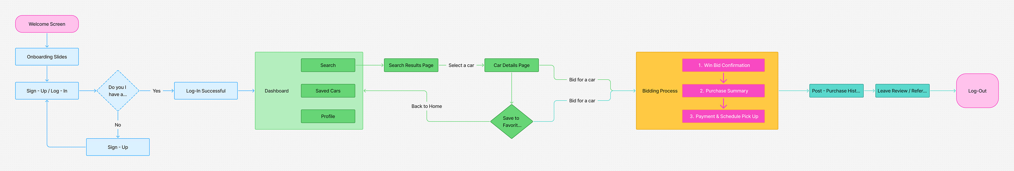
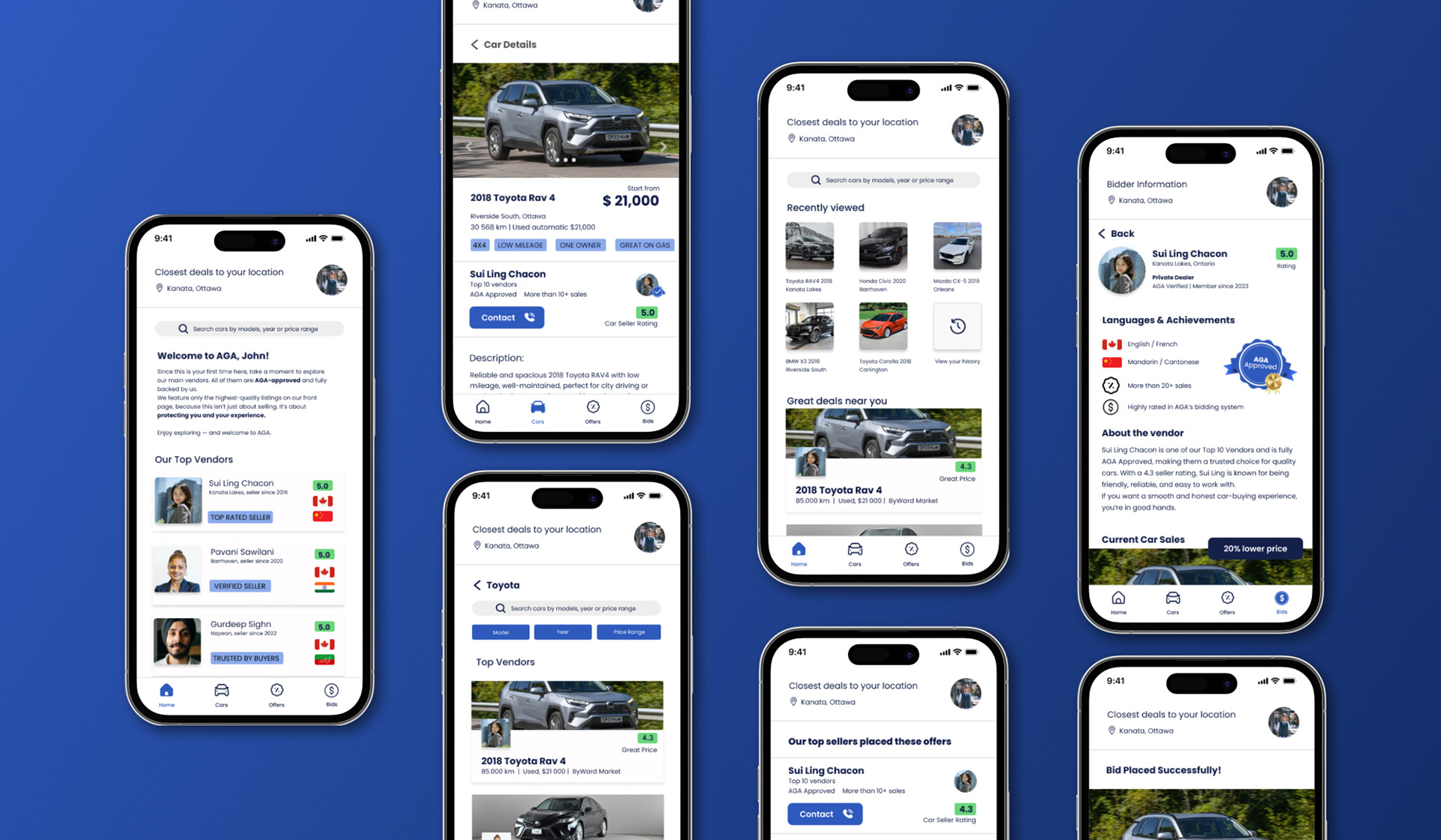
Information architecture approach
We modeled AGA as a simple, streamlined service app, not just a listing site.
The architecture was designed to:
● Surface trust signals early (verification, seller credibility, vehicle indicators)
● Keep users oriented with a predictable flow
● Reduce errors during bidding by making steps explicit
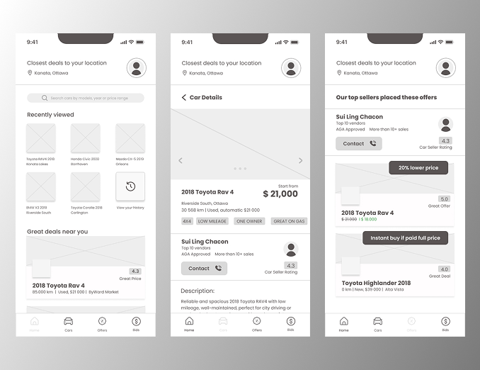
Prototyping
We moved from low-fi wireframes to an interactive prototype to validate navigation and task completion before investing time into polish.
This helped us focus on:
● Clarity of information
● Clarity of information
● Flow predictability
● Reducing decision anxiety during bidding
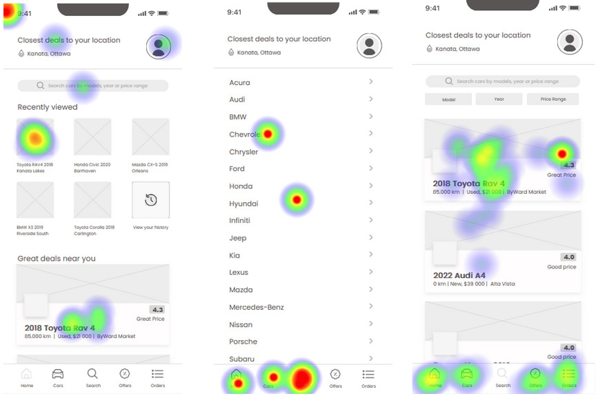
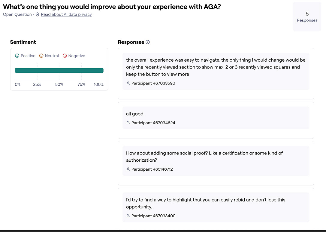
Usability testing (Maze)
To validate key tasks, we prepared usability tests in Maze by importing the Figma prototype and creating three separate tests focused on different app sections. Each included missions, contextual questions, and sight tests.
We then ran the tests with another team, reviewed results and heatmaps, and used the findings to decide what to refine before moving into hi-fi.
We then ran the tests with another team, reviewed results and heatmaps, and used the findings to decide what to refine before moving into hi-fi.
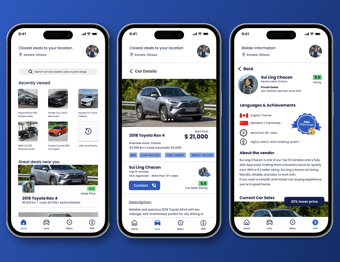
Goal → Design response
● Trust & safety → verified listings + transparent bidding flow
● Convenience → browse/compare/bid directly on mobile
● Reduce search fatigue → smart recommendations based on user previous searches
Quality, accessibility, and usability
This project aligns with a quality-management mindset: embedding usability and accessibility considerations throughout the design lifecycle, not at the end.
Next validation steps I would run in a real product environment:
● Accessibility review (contrast, touch targets, error prevention, plain language)
● Usability testing with diverse, first-time user groups
● Iteration planning based on evidence (testing + feedback)
Collaboration
I worked in a team environment with structured milestones, peer feedback, and testing handoffs, including focus-group style feedback sessions and iterative refinement based on results.
What I learned
This case study reinforced something I care about in UX: good design isn’t just visual, it’s a process of defining risk, modeling user needs, testing assumptions, and iterating based on evidence.
Next steps:
● Run a second Maze round focused on newcomer clarity and task confidence
● Improve accessibility + error prevention
● Tighten content hierarchy based on where users hesitate most